The Brief
Melbourne-based creative agency: Floodlight, reached out to me to help redesign the EVO Power website. The agency were already completing a full rebrand for EVO Power and the website was a part of it. The brief was to deliver a new website design inline with the new brand guidelines and offer support to EVO’s in-house developer who was building his first site.
My Process
The phrase at the heart of EVO’s rebrand was to become “the Bendigo Bank of BESS (Battery Energy Storage Solutions)”. Essentially, they were the local, community-focused alternative to the larger, impersonal corporations. The design needed to make extensive use of the new brand imagery focused on the people of EVO Power and bring attention to their community focus.
The website copy was provided for me from the get-go. While the brand guidelines and photoshoots were completed, I focused on creating wireframes and creating layouts that took advantage of both the copy and images.
Once the brand guidelines were complete and the imagery finalised, I “coloured-in” the wireframes and presented to the client. After 2 rounds of revisions, the designs were completed.
Key Decisions
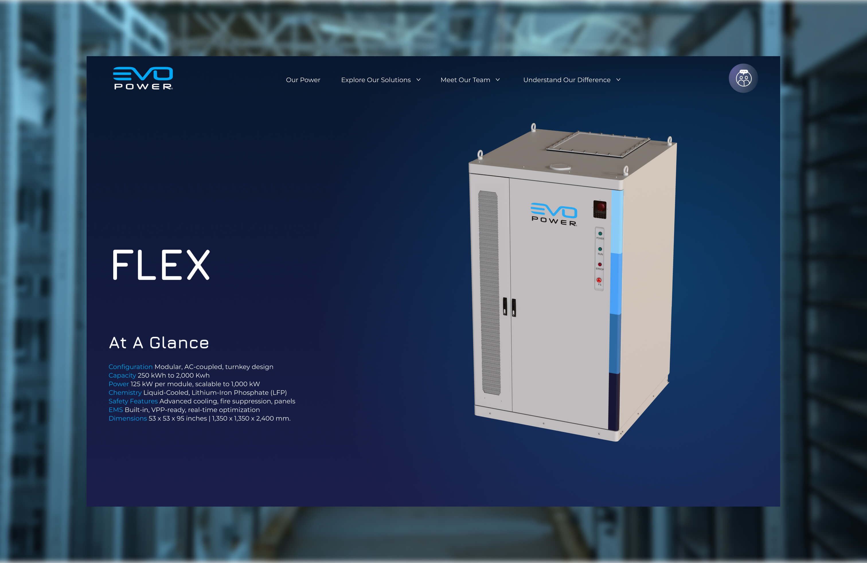
In early discussions with the agency and client, they were keen to add a lot of complex animations and make use of their 3D models. After meeting EVO’s in-house developer, we learned that he was relatively new and not comfortable with that level of complexity. For that reason we dialled back the features of the site to ensure that the developer was confident he could build them.
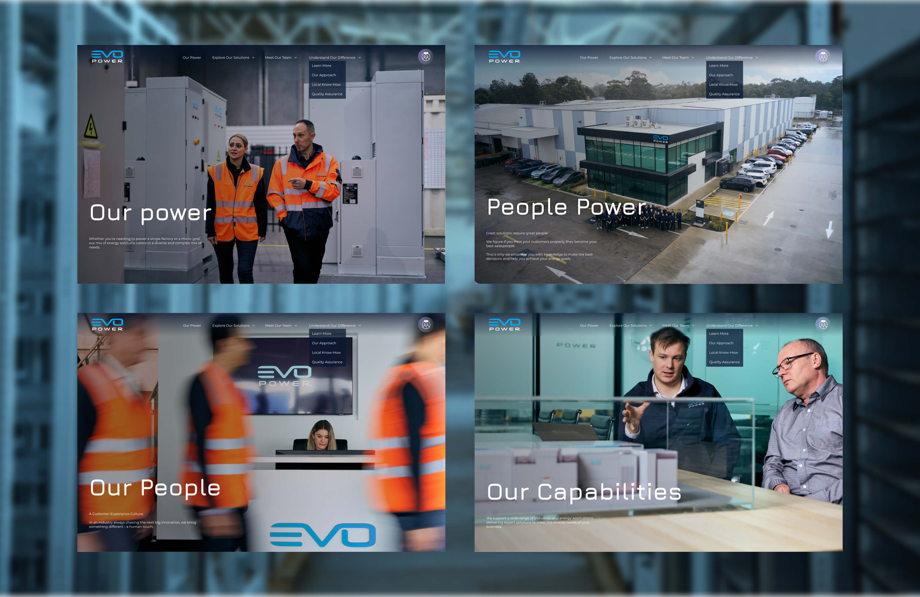
The client was keen to present themselves as a people-focused and community-focused company. The brand imagery was mainly focused on the people of EVO Power rather than the products. For that reason, the hero section of most pages feature images of the EVO Power people that are relevant to that page.
The Outcome
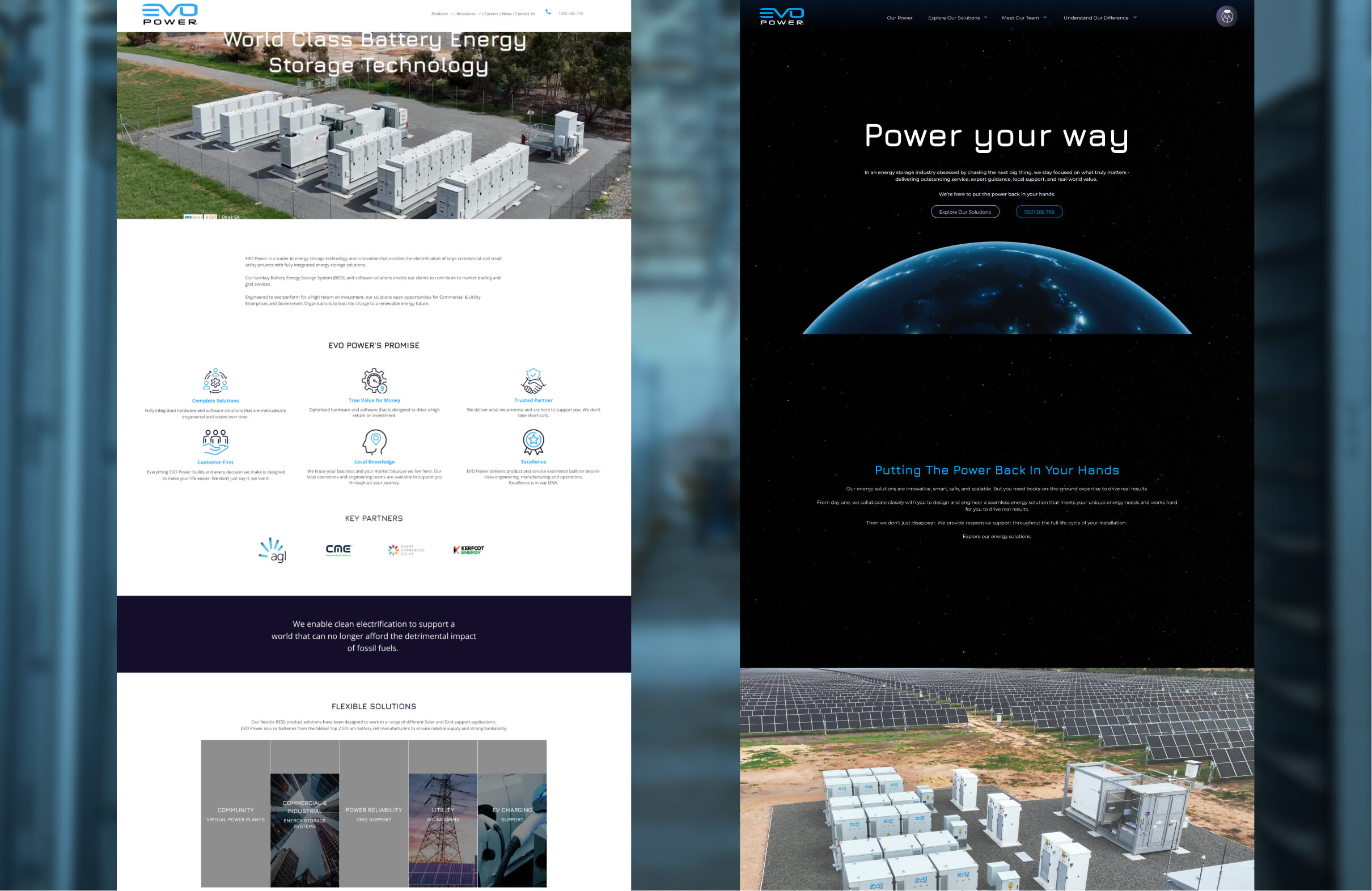
The website design delivered on the spec from the brief. It used the people-focused brand imagery to present EVO Power as the more community-focused and personal choice in the BESS arena. It stayed inline and built upon the new brand guidelines to give a more modern and brand-focused feel to the website.