The Brief
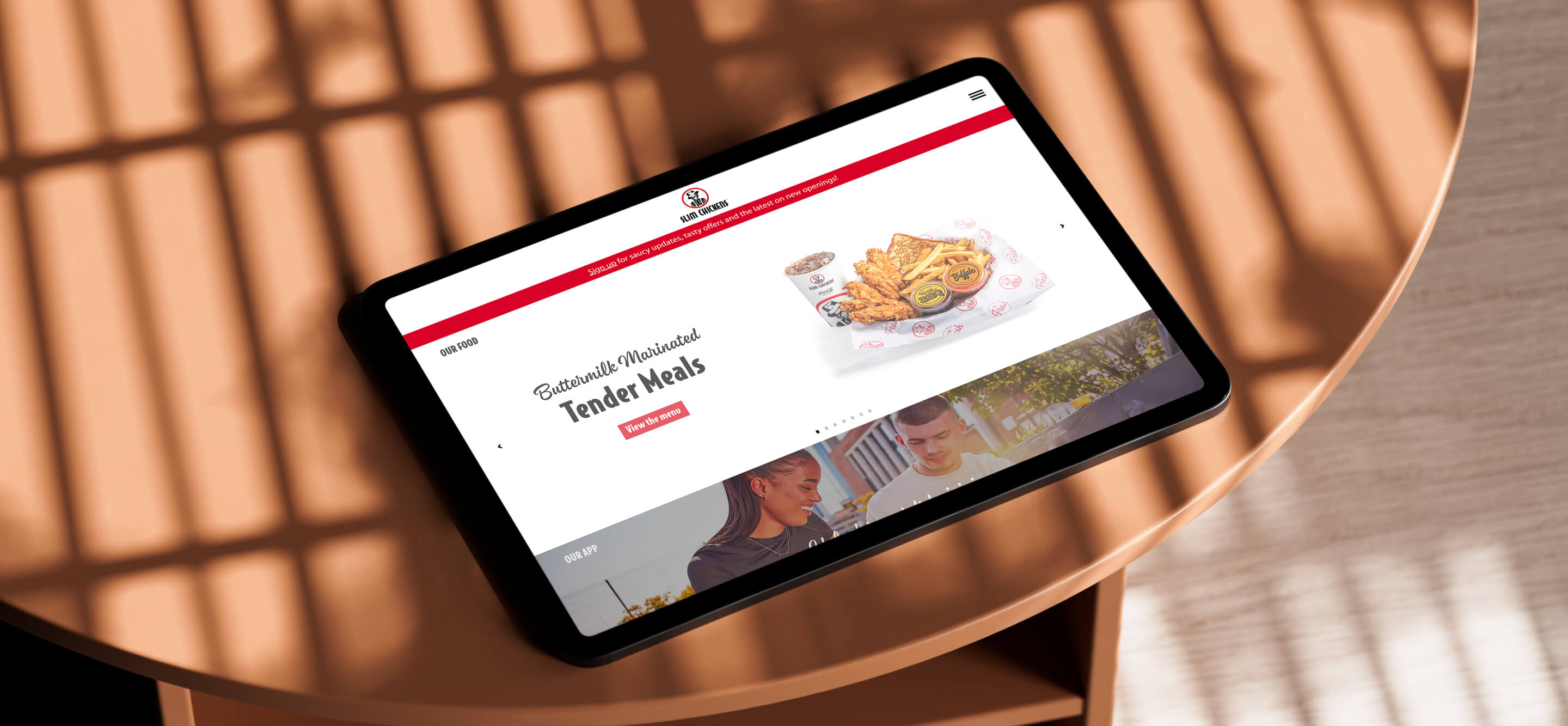
Slim Chickens were looking to develop a "lifestyle brand" and wanted a new website design to suit it.
The old site used a lot of text baked into images leading to certain screen sizes cropping key messaging. It was important for the new site to be more dynamic and responsive.
Slims pointed to restaurant chains like Tortilla and Joe & The Juice as inspiration. Noting the way they segmented information and made strong use of brand assets.
In summary, the brief was to design and build a responsive, brand-led website. It was important to keep navigation as seamless as possible and key information easy to find.
My Process
Slims initially asked me to compare their website with Tortilla’s. They saw Tortilla as a website to try and emulate. I went through each page. I analysed Tortilla's design decisions and how they could apply to Slim Chickens. I took my findings and created a proposal outlining possible changes we could make to the Slims site. The proposal included a description of each change and its potential impact.
Once they approved my proposal, I designed the new site in Adobe XD. I reused a lot of the existing content but found new ways to present it that suited the Slims brand.
Key Decisions
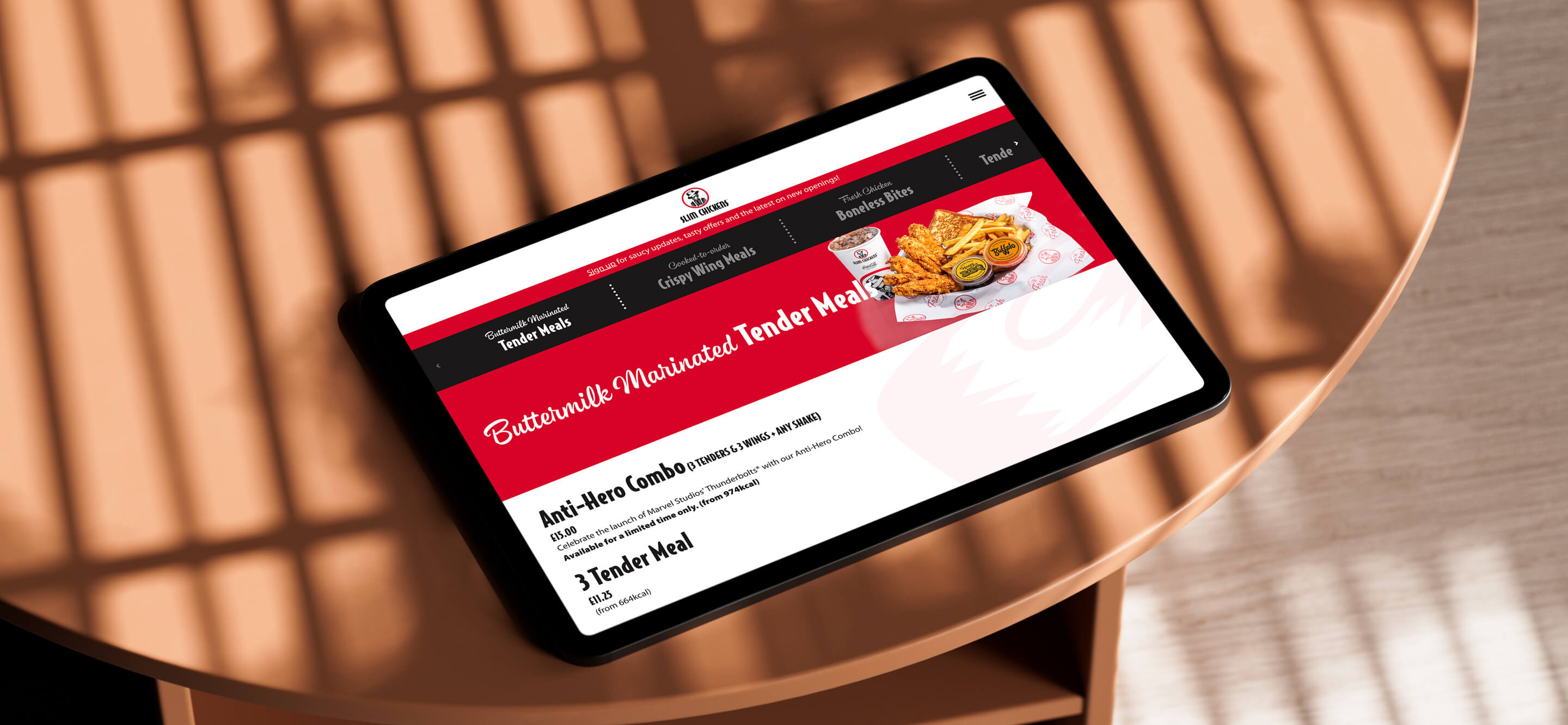
One key takeaway from Tortilla's site was their use of colour to segment information. I applied this to the Slims site by alternating background colours in page sections. Initially, I used white and a lighter shade of the brand-red, but Slims pushed back. They reminded me that the palette must stick to the core brand colours. This led me to use light and dark themes for the sections using charcoal grey instead of the light-red. Using these colours created a much stronger contrast between sections. That contrast played into the bold, vibrant, and youthful brand Slims wanted.
After the new site went live, there was some immediate negative feedback from users. Due to Slim Chickens having a large menu, I split the menu out into different pages. My reasoning was to avoid users having to scroll for a long time to find what they wanted. I had not considered the friction created for users having to bounce between menu pages. What users preferred was having the menu on one page. To solve the problem of too much scrolling on one page, I included a carousel navigation fixed to the top of the page. This approach is how apps like Deliveroo and UberEats navigate long menu lists. It is also reminiscent of how self-service ordering works in the restaurants. This was a method of menu browsing customers know and was more widely accepted.
The Slims "lifestyle brand" focuses on people. How they interact with and connect through food. It was important to include more people-focused imagery on the site. For that reason, I added "lifestyle images" to the bottom of information pages. Doing this brings more life to copy-heavy pages and adds to Slims' people-focused brand.
The Outcome
The brief was to create a responsive, brand-led, easy-to-navigate website. The new design delivers on this brief. It uses clear segmentation and signposting for easy navigation. It has more "lifestyle images" to align with the Slim Chickens brand. And, it uses simple layouts on every page to easily respond to both mobile and desktop screens.